Hello everyone! Have been very busy trying to wrap up some projects before the holidays, always a mad rush, isn't it? I'm going to make a real effort to share more online consults with you, as they are becoming the mainstay of my business, and we all love to see design boards, right?!! This one is fairly recent, and with all of us entertaining over the holidays, a few of us (myself included) may want to do a little sprucing up in the loo!
Bathrooms often are the last rooms we look at in our homes. Slap some colour on the wall, hang a shelf or cabinet, maybe swap out the mirror, and we're done, right? Well, not for this client! Let's call her A, shall we? While A had already completed the rest of her home on her own, she really wanted her Master Ensuite to have some personality. Her question: could we bring a standard bathroom up to the level of her other rooms? This consultation, like many online consultations, morphed from a Color Consult into a Design Consult as we progressed. The beauty of working online is that I can accommodate any time frame, from days to months, and we can bounce ideas back and forth until the client is completely satisfied. I'm amazed how much my online service has grown, and have to send out a huge thank you to all of my amazing clients!!
A's home is located in a historical building which has been converted into lofts, complete with beautiful wood beams and original fireplaces, etc… really great bones. This particle room did not include any period architecture, but the builder had used clean-lined modern fixtures and sleek tile, so we had a nice base to work with.

In terms of personal preference, A wanted to add a grey to the walls, and was up for a darker tone, which would complement her bedroom (painted in BM San Antonio Gray) and other spaces. Other than that, she was open for ideas on how to decorate the walls, etc.
The darker grey walls work in this small space because there is a fair amount of warm natural light, large swathes of white fixtures, and that large mirror over the vanity. I recommended Chelsea Gray, Benjamin Moore HC 168, which would complement the San Antonio Gray bedroom walls.

The first thing that I suggested is to bring some wood into the space, as reclaimed and timeworn woods are a large part of the aesthetic of the rest of the home. A few examples of the palette at work were included to show A.
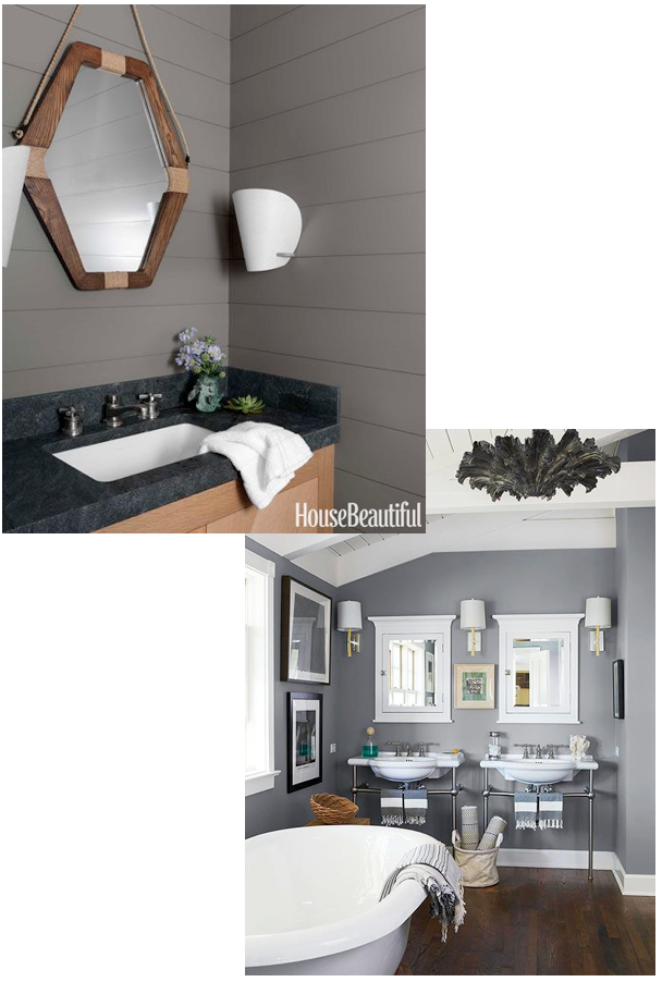
Since we had to look at finished or replacing the large builder mirror, the frame for this was a natural placement for the wood element. I suggested a few options. The first was to frame out the existing mirror. The second was to layer a wood framed mirror over top of the existing mirror.


Bringing in some darker metal elements would reference the feel of her main living space. I suggested a small wall cabinet or shelf over her toilet, in/on which she could place white towels and accessories to again bring that freshness back into the space. A did not like here existing towels hook beside the sink, which was rather largely proportioned. I suggested a modern hook option here, something unexpected to add interest.


After looking at all my recommendations, A decided the paint was perfect, and she would frame out the mirror in wood, She had found some towel hooks on Etsy that she loved, and wanted work in gold to the mix.

Also, she decided she did not want additional storage, and asked if an art wall would work over the toilet in lieu of the shelf. The area is 36" x 36".

Why not? I'm huge fan of art in every space, a room without art is not complete! This offered an opportunity to repeat the varied metal elements, as well. A mentioned liking the prints available on Lulu and Georgia, and so that became the starting point for two gallery options. I chose two prints, the Booby Pin piece and the Oh Dear I love you, which A had especially liked, to begin.
The first grouping was modern and playful, and worked in some colour. Two modern photographs (here and here) flank the Oh Deer print, both referencing the mountains outside. A had mentioned wanting to include a letter, if possible, and so custom wooden letter from Etsy painted gold would add that bit of sparkle. Lastly, a fresh fractal work plays against the photos and grey walls, and keeps the grouping light and airy.

The Bobby Pin started off the second grouping, which is softer and more sophisticated. A watercolor becomes the central piece, the watery texture perfect for a bath. A small pen and ink adds some punctuation and balances the bobby pin print. A steel letter tucks in without stealing the show, and an original oil is absolutely stunning, working in all of our varied tones and adding some subtle colour here.

A chose the second grouping, but her husband did not like the Bobby Pin print, so we needed to work in a replacement. I suggested a nude, which works with the more sophisticated feel of this group. After considering a few options, A chose this print, which is perfect.

After receiving the art, A ordered some frames on Etsy. She chose this wood frame for the abstract watercolor, and this gold frame for the painting.
Now we just needed to finish up with another small piece of art for the entry wall, on the right side of the window. I suggested this original painting. The artist mounts each of her works in vintage frames which are included in the sale. It is a beautiful effect. A agreed. Yay! Love it when a client and myself are completely on the same page!

And that wraps up the bathroom swish, lovelies! I hope you enjoyed, and maybe discovered a few new artists along the way…my apologies if I lured you into lost hours on Etsy - can never get away from once I begin exploring the art shops, lol.
Wishing you all a lovely, Christmas-Carol-filled day - x am


