Showing posts with label online consultation. Show all posts

Thursday, May 28, 2015

Making A Dark Wall Color Work in a Small Apartment


A and his partner B contacted me recently for a colour consultation. They are a young couple, living in NY, and so space is at a premium.

They were moving into a classic one bedroom apartment, with a small kitchen open to a combined living/dining area, one large window at the end of a long rectangular space. The landlord of their new apartment had graciously agreed to paint for them, including one accent wall of their choosing in the main space. A and B had ideas about what direction they wanted to go, but were looking for some assistance selecting the specific wall color in their new home. 


Below is a similar layout, so that you can get the idea…


We moved onto the design questionnaire phase, and they explained that they were looking to add a dark accent wall in the living space - would that work, they asked? Which wall should they paint? What should they paint the other walls?

A and B already had a Kivik sofa, upholstered in dark grey, a dark brown entertainment console, and were purchasing a small side c-table with an industrial feel. Their kitchen, which was open to the main living space, consisted of antique white cabinetry and dark grey stone countertops, and the entire space had gorgeous walnut flooring.


After looking through their pinterest boards, it was clear that A and B were after a slightly moody transitional space that incorporated industrial elements. When discussing the design direction with them, I mentioned masculine as a descriptive word - to which B replied that she definitely wanted their home to reflect that a woman lived there.

So how to make this desire for dark and moody, add some feminine elements, and make it all work in a small-scale space with limited natural light?

First off, I suggested painting the accent wall behind the sofa, and using a dark grey similar in tone to the upholstery. It always makes a room feel more spacious when the largest pieces are similar in tone to either the flooring or the walls, I discussed this in a previous post, here.

Next, I suggested keeping the rest of the space nice and airy, with a soft white that would work with the Antique finish on the cabinetry. Adding a wall of white linen curtains would soften the space without taking away any of our precious sunlight. A rug underfoot should bring in the grey and the white, to link the two and and some pattern. A glass topped-table disappears visually, but the curvaceous wood frame breaks up all the grey. Copper and gold metal accents, in lighting and accessories, will add some curves, warmth and pick up on the wood tones of the floors. Artwork over the sofa should be glass-fronted, bold and primarily white, or a large mirror would work here to bounce as much light as we can into the space.  Of course, a large plant near the window is a must, every room needs life.


 A & B prefer to work with Behr paints, so for the dark grey accent wall we chose the dusky Evening Hush, and then the beautiful soft chalky white Swan Wing for the rest of the walls.


A & B inquired about which accent colours to add here. A dark grey and white palette, paired with warm woods, naturally lend themselves to greyed pastel or jewelled tone accents.

My choice here would be to add a little femininity through some amethyst accents, look at the difference in feel created by simply adding a few throw pillows…


As a side note, as shown on the sofa, I found an Etsy seller, ArtPillow whose textiles are printed with her original artworks, offering up some pretty spectacular swirling explosions of colour available as shower curtains, pillows, and duvet covers…


Colorlicious, right? Art for your sofa. Dying.


Okay, I am easily distracted by art and colour, but getting back on track :)) every consult has one main driving issue, and this one was how to use a dark colour in a smaller space with one window..

There were four things to take note of here:

1. Using a similar wall colour as the sofa, the largest piece of furniture in the space, groups them together as one, visually, and keeps the room feeling more open.

2. Large, primarily white art fronted by glass bounces light into the space.

3. Painting out the other walls in a soft white, and using a floor-to-ceiling white window treatment, allows for maximum light and minimizes visual clutter on the other walls, allowing the room to "open up".

4. One element should bridge the gap between colors, here the rug fills that need.


My clients were very happy with the end results, which is the main focus around here…

What do you think? Would this design work for you?

am xo


Thursday, April 23, 2015

Online Consultation: Art Placement Over a Console Table


A little while back I had a client who requested help choosing art for her master ensuite bath. She has a fabulous arts and crafts meet industrial loft, and decided that her console table in the living/dining room was looking a little lonely. Voila, another art wall was in the works… thought you may enjoy seeing what I came up with here.

If you know me at all, you know I prefer to support and invest in original works whenever possible, and Etsy is my favourite place to play :)) so get ready for a juicy list of Etsy sellers ahead!! The space over a console table is the perfect place to indulge in a little art grouping, it's something I incorporate in most of my clients interiors.


As you can see, A. has fabulous taste and a great design sense. 
She has chosen perfectly scaled pieces with the right lines, materials and style for her home.

This drop-leaf table and chairs pull out and double as a formal dining space when guests come over, clever right?

First off, we needed to centre the grouping on the wall. 

Next I chose to incorporate the St Germain Swing Lamp, which offers soft mood lighting on an everyday basis and task lighting when the area is used for dining.

The existing buffalo print is fantastic, it just needed a little company, 
some smaller pieces that still allow it to be the focal point.
By hanging this off centre we can work out a more interesting arrangement.

A mirror offers up some sparkle, and an interesting shape breaks up all the rectangles.

Over top, a romantic equine photo perfectly suits a young couple.

For balance,  a pair of prints beside the light reference the white in our other framed works,
 but add softness and modern elements.

The portrait collage  print up top is by my current favourite art crush, 
a post on her work will be up shortly - it's too good!

The nude represents a piece A. already had which we wanted to incorperate...

Since A. resides in the Pacific NW, and we have used feathers in her wall art previously,
 a feather headband adds some texture to the grouping.

Beneath, a wooden carved city map represents a place close to my clients heart.


The sculptural bits on the table are from West Elm, and link the elements common to this space.


A. loved the grouping, but wanted to swap out two of the pieces -
incredibly, she already had the Horse Photo in her bedroom, 
and she preferred to use a feather element that didn't make an cultural reference.


We looked at a few substitute pieces… to replace the horse photo…


1 2 3 4


to replace the feather headband…


1 2 3


What do you think? Any of these pieces tickle your fancy?

am xo


Thursday, January 29, 2015

The Ranch: Dining Nook to Hearth Room


Have you ever heard the term Hearth Room? Back in the day, this was the space where the family gathered, the true heart of the home, all centred around the fireplace. Now we generally have the family room, which is larger, located well off the kitchen, and tends to centre around the television. Those small intimate rooms had such a welcoming, come-home feel, and sometimes we lose that in todays larger spaces.

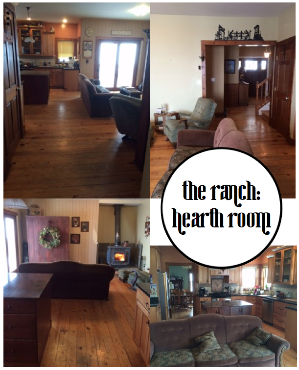
I recently had a client contact me with an interesting space. She had an open kitchen, with a space located off the cooking area that was surely meant as a dining area by the original builder. In this home, however, a mature couple with grown children and grandchildren, they dined in the dining room, and used the space as a hearth room.  It contains a wood stove which is lit daily, is fairly narrow in proportion, and the design must include a large cabinet that was a family heirloom.  The current furniture layout did not provide a conversational area. The home is situated on a working ranch, and gets lots of use by the residents, visiting family and friends, and their furry friends! This where they most often entertain guests and relax at the end of a long day of hard work.  J suggested most often the space would be used by two or four adults, and little ones that visited. The current furniture had seen better days, and the lady of the house was ready for a change! I came to see very quickly that J embodies the term gracious, and I wanted to give her and her husband a space where they could truly recharge, and that worked well for conversation with guests.


The first layout I suggested involved moving the large cabinet to another wall of the space, creating a different proportion in the room, that allowed for a sofa and two chairs to be paired facing each other.

J had struggled with the colour of the wood stove for many years. A true fan of warm earth tones, the navy stove was not working with the other colors in the space. J has gorgeous pine plank floors, wood kitchen cabinetry, and black stone counters with a warm neutral tile backsplash. We are working with yellow/orange tones in the woods, and slightly cooler neutrals on the tile. J had suggested she was open to bringing in greys here, however the rest of her home is warm and earthy. The large cabinet is a true antique barn red, which must be incorporated here, with the blue. Grey wasn't ring to work, but the walls could go a cooler beige, heading into the greige category, which would provide a soft backdrop. As the walls are similar in tone to the kitchen cabinetry, they don't divide the space visually, creating a more cohesive, larger feel.

Leather is perfect for the sofa, in a warm rich caramel, which is durable and will only look better with age and use.  Two wicker chairs add some texture and a little interest. An small black bench J already had would work as a coffee table, and we would bring in some pattern in textiles to work in the blue and red.

A large photo positioned over the sofa would ensure this was the focal wall, and we could now add two wall mounted sconces, in a flat black iron finish, to address the need for softer evening lighting. A ranch needs horses, right? I had a particular piece in mind from a very recent art consult, which I will share shortly.


J responded that she loved the palette and finishes, but that she had tried to place that cabinet on the side wall previously, and it did not work. She was completely right, it was far to large for that wall. This is where the back and forth comes in, something I love about the online process, we can work to find the best solution, instead of you just receiving a single design. J said that it could be moved to another space if need be, but I knew that in her heart she wanted it there, as it reminded her of her Grandfather, clearly a man she had loved dearly.  I needed to find a better layout that would allow the cabinet to remain in place.


I suggested something a little less conventional, placing four chairs in a grouping in the centre of the space, circling and round coffee table. By using this type of floor plan, we could provide seating for four very comfortably, and would include some ottomans tucked into the coffee table for footstools and as occasional seating for little ones. We would add a low bookcase on the side wall, and place lighting and the artwork there. J could display some of her favourite quilts on the shelves, as well as the games and books that would be used in the space. This is a great solution because the room remains open and inviting, but allows for intimate conversation.


Four matching leather chairs, in the warm caramel tone, form the base grouping. The key to this working, proportionally, is choosing chairs with wide seats, for comfort, and narrow arms, to keep their footprint fairly narrow.  The round table works for ease of movement, and a piece with reclaimed wood top and metal base keeps it light visually, and would tie in the countertops and lighting as well as the more rustic pieces in J's home.  J was very happy with everything, and went to to get a paint sample. Although she did not love the color on the paint chip, once she got it on the walls she loved it :) J painted her walls right away, and began to look locally for the leather chairs.  Once she those she will move onto ordering the other pieces.


The paint colour used here is Benjamin Moore Natural Linen 966.
The beautiful photograph is from Kara Rosenlund.
The table and bookcase are from World Market.


Nothing beats the moment when a client goes from "what do I do with this space?" to "I can't wait to get started on this space!".  It happens during every consult, and to hear the excitement and happiness that my clients are feeling is the reason I love my job! Our homes should make us happy, right? That's my goal, making sure they do...

Have great day! Will try to post about a few other consults shortly :)
 Am always getting requests for examples of the online process…  x am

Monday, December 15, 2014

Online Consult: Give a Standard Master Ensuite Bathroom Some Personality


Hello everyone! Have been very busy trying to wrap up some projects before the holidays, always a mad rush, isn't it? I'm going to make a real effort to share more online consults with you, as they are becoming the mainstay of my business, and we all love to see design boards, right?!! This one is fairly recent, and with all of us entertaining over the holidays, a few of us (myself included) may want to do a little sprucing up in the loo!

Bathrooms often are the last rooms we look at in our homes. Slap some colour on the wall, hang a shelf or cabinet, maybe swap out the mirror, and we're done, right? Well, not for this client! Let's call her A, shall we? While A had already completed the rest of her home on her own, she really wanted her Master Ensuite to have some personality. Her question: could we bring a standard bathroom up to the level of her other rooms? This consultation, like many online consultations, morphed from a Color Consult into a Design Consult as we progressed. The beauty of working online is that I can accommodate any time frame, from days to months, and we can bounce ideas back and forth until the client is completely satisfied. I'm amazed how much my online service has grown, and have to send out a huge thank you to all of my amazing clients!!

A's home is located in a historical building which has been converted into lofts, complete with beautiful wood beams and original fireplaces, etc… really great bones. This particle room did not include any period architecture, but the builder had used clean-lined modern fixtures and sleek tile, so we had a nice base to work with.


In terms of personal preference, A wanted to add a grey to the walls, and was up for a darker tone, which would complement her bedroom (painted in BM San Antonio Gray) and other spaces. Other than that, she was open for ideas on how to decorate the walls, etc.

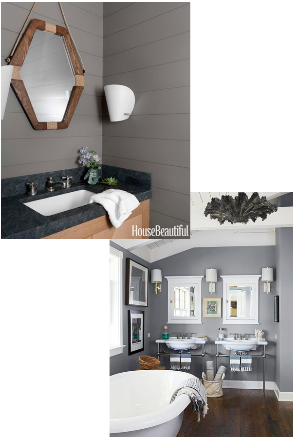
The darker grey walls work in this small space because there is a fair amount of warm natural light, large swathes of white fixtures, and that large mirror over the vanity. I recommended Chelsea Gray, Benjamin Moore HC 168, which would complement the San Antonio Gray bedroom walls.


The first thing that I suggested is to bring some wood into the space, as reclaimed and timeworn woods are a large part of the aesthetic of the rest of the home. A few examples of the palette at work were included to show A.


Since we had to look at finished or replacing the large builder mirror, the frame for this was a natural placement for the wood element. I suggested a few options. The first was to frame out the existing mirror. The second was to layer a wood framed mirror over top of the existing mirror.


Bringing in some darker metal elements would reference the feel of her main living space. I suggested a  small wall cabinet or shelf over her toilet, in/on which she could place white towels and accessories to again bring that freshness back into the space. A did not like here existing towels hook beside the sink, which was rather largely proportioned. I suggested a modern hook option here, something unexpected to add interest.


After looking at all my recommendations, A decided the paint was perfect, and she would frame out the mirror in wood, She had found some towel hooks on Etsy that she loved, and wanted work in gold to the mix.


Also, she decided she did not want additional storage, and asked if an art wall would work over the toilet in lieu of the shelf. The area is 36" x 36".


Why not? I'm huge fan of art in every space, a room without art is not complete! This offered an opportunity to repeat the varied metal elements, as well.  A mentioned liking the prints available on Lulu and Georgia, and so that became the starting point for two gallery options. I chose two prints, the Booby Pin piece and the Oh Dear I love you, which A had especially liked, to begin.


 The first grouping was modern and playful, and worked in some colour. Two modern photographs (here and here) flank the Oh Deer print, both referencing the mountains outside. A had mentioned wanting to include a letter, if possible, and so custom wooden letter from Etsy painted gold would add that bit of sparkle. Lastly, a fresh fractal work plays against the photos and grey walls, and keeps the grouping light and airy.


The Bobby Pin started off the second grouping, which is softer and more sophisticated. A watercolor becomes the central piece, the watery texture perfect for a bath. A small pen and ink adds some punctuation and balances the bobby pin print. A steel letter tucks in without stealing the show, and an original oil is absolutely stunning, working in all of our varied tones and adding some subtle colour here.


A chose the second grouping, but her husband did not like the Bobby Pin print, so we needed to work in a replacement. I suggested a nude, which works with the more sophisticated feel of this group. After considering a few options, A chose this print, which is perfect.


After receiving the art, A ordered some frames on Etsy. She chose this wood frame for the abstract watercolor, and this gold frame for the painting.

Now we just needed to finish up with another small piece of art for the entry wall, on the right side of the window. I suggested this original painting. The artist mounts each of her works in vintage frames which are included in the sale. It is a beautiful effect. A agreed. Yay! Love it when a client and myself are completely on the same page!


And that wraps up the bathroom swish, lovelies! I hope you enjoyed, and maybe discovered a few new artists along the way…my apologies if I lured you into lost hours on Etsy - can never get away from once I begin exploring the art shops, lol.

Wishing you all a lovely, Christmas-Carol-filled day - x am