Thursday, January 29, 2015

The Ranch: Dining Nook to Hearth Room


Have you ever heard the term Hearth Room? Back in the day, this was the space where the family gathered, the true heart of the home, all centred around the fireplace. Now we generally have the family room, which is larger, located well off the kitchen, and tends to centre around the television. Those small intimate rooms had such a welcoming, come-home feel, and sometimes we lose that in todays larger spaces.

I recently had a client contact me with an interesting space. She had an open kitchen, with a space located off the cooking area that was surely meant as a dining area by the original builder. In this home, however, a mature couple with grown children and grandchildren, they dined in the dining room, and used the space as a hearth room.  It contains a wood stove which is lit daily, is fairly narrow in proportion, and the design must include a large cabinet that was a family heirloom.  The current furniture layout did not provide a conversational area. The home is situated on a working ranch, and gets lots of use by the residents, visiting family and friends, and their furry friends! This where they most often entertain guests and relax at the end of a long day of hard work.  J suggested most often the space would be used by two or four adults, and little ones that visited. The current furniture had seen better days, and the lady of the house was ready for a change! I came to see very quickly that J embodies the term gracious, and I wanted to give her and her husband a space where they could truly recharge, and that worked well for conversation with guests.


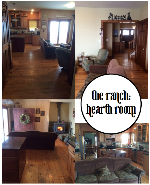
The first layout I suggested involved moving the large cabinet to another wall of the space, creating a different proportion in the room, that allowed for a sofa and two chairs to be paired facing each other.

J had struggled with the colour of the wood stove for many years. A true fan of warm earth tones, the navy stove was not working with the other colors in the space. J has gorgeous pine plank floors, wood kitchen cabinetry, and black stone counters with a warm neutral tile backsplash. We are working with yellow/orange tones in the woods, and slightly cooler neutrals on the tile. J had suggested she was open to bringing in greys here, however the rest of her home is warm and earthy. The large cabinet is a true antique barn red, which must be incorporated here, with the blue. Grey wasn't ring to work, but the walls could go a cooler beige, heading into the greige category, which would provide a soft backdrop. As the walls are similar in tone to the kitchen cabinetry, they don't divide the space visually, creating a more cohesive, larger feel.

Leather is perfect for the sofa, in a warm rich caramel, which is durable and will only look better with age and use.  Two wicker chairs add some texture and a little interest. An small black bench J already had would work as a coffee table, and we would bring in some pattern in textiles to work in the blue and red.

A large photo positioned over the sofa would ensure this was the focal wall, and we could now add two wall mounted sconces, in a flat black iron finish, to address the need for softer evening lighting. A ranch needs horses, right? I had a particular piece in mind from a very recent art consult, which I will share shortly.


J responded that she loved the palette and finishes, but that she had tried to place that cabinet on the side wall previously, and it did not work. She was completely right, it was far to large for that wall. This is where the back and forth comes in, something I love about the online process, we can work to find the best solution, instead of you just receiving a single design. J said that it could be moved to another space if need be, but I knew that in her heart she wanted it there, as it reminded her of her Grandfather, clearly a man she had loved dearly.  I needed to find a better layout that would allow the cabinet to remain in place.


I suggested something a little less conventional, placing four chairs in a grouping in the centre of the space, circling and round coffee table. By using this type of floor plan, we could provide seating for four very comfortably, and would include some ottomans tucked into the coffee table for footstools and as occasional seating for little ones. We would add a low bookcase on the side wall, and place lighting and the artwork there. J could display some of her favourite quilts on the shelves, as well as the games and books that would be used in the space. This is a great solution because the room remains open and inviting, but allows for intimate conversation.


Four matching leather chairs, in the warm caramel tone, form the base grouping. The key to this working, proportionally, is choosing chairs with wide seats, for comfort, and narrow arms, to keep their footprint fairly narrow.  The round table works for ease of movement, and a piece with reclaimed wood top and metal base keeps it light visually, and would tie in the countertops and lighting as well as the more rustic pieces in J's home.  J was very happy with everything, and went to to get a paint sample. Although she did not love the color on the paint chip, once she got it on the walls she loved it :) J painted her walls right away, and began to look locally for the leather chairs.  Once she those she will move onto ordering the other pieces.


The paint colour used here is Benjamin Moore Natural Linen 966.
The beautiful photograph is from Kara Rosenlund.
The table and bookcase are from World Market.


Nothing beats the moment when a client goes from "what do I do with this space?" to "I can't wait to get started on this space!".  It happens during every consult, and to hear the excitement and happiness that my clients are feeling is the reason I love my job! Our homes should make us happy, right? That's my goal, making sure they do...

Have great day! Will try to post about a few other consults shortly :)
 Am always getting requests for examples of the online process…  x am

Sunday, January 18, 2015

A New Layer: Desks


So we've seen layered rugs, and footstools layered under coffee tables, but what about layered desks?

This is a really interesting idea.

You get the best of both worlds - 
glam legs and a large glass work surface on the outside,
combined with storage and some soul tucked in underneath.


 Something you would try? 

am x

Wednesday, January 14, 2015

Traditional Style Open Living

Usually open living means a space that is industrial, modern or minimalist. How often do we see a true multipurpose living space which includes more traditional styling and multiple layers?

This spectacular room sees living, dining and office perfectly incorporated into one, large space. It really makes you rethink the need for all those walls, doesn't it?


So many noteworthy ideas here...

Warm tonal hues create a soft welcoming envelope for living.

Note the way the sofa is presented - a large banquette that starches the length of the wall, it can accommodate several people at once and yet takes up minimal area.

A large sculptural table takes centre stage, and as the darkest piece in the room it is grounded although floating atop several large cowhides.

The office area along the right side of the space includes two generous workspaces, and cleverly uses additional dining chairs, which link the areas and allows them to be pulled to the table for larger groups.

A wall of storage above the workspaces is busy, but balanced by the wall of mirror on the left, which fills in the large area above the banquette without further visually cluttering the room.


What do you think? Would this work for how you live?

x am


Monday, January 5, 2015

January Blues: Navy


It's January, and with January always comes the return of blue. Why is this? Perhaps in response to the glut of red we've just surrounded ourselves with for the holidays, perhaps because of the yearning for the warmer days and the sea… I'm not sure, but whatever the reason, blue is the colour of January.

Feeling inspired, thought I may put together a few design boards based on nautical blues, island blues, you get the drift (pardon the pun, couldn't help myself!)…

The painting by Jennifer Latimer got the board started. Such gorgeous texture! Generally, unless you have a space drenched in warm light, navy and pure white are too harsh a combination. Navy works beautifully with soft whites, warm woods and grieges, and that's where I took this space.

The humble rattan chairs are so sculptural that they can hold their own against a Milo Baughman sofa and brutalist sconces. That carpet provides a much needed textural element against all those sleek surfaces. Imagine a wall of glass behind that sofa, graced by flowing linen panels...


What do you think? 
Does this combination of navy paired with soft, warm, neutral layers appeal to you?

x am


Friday, January 2, 2015

Happy New Year

Happy New Year!


What are you all planning for 2015? Any exciting changes? Perhaps less change?

We are still pursuing simplification around here, trying to find more balance.
As the kids get older, we realize how precious our time with them is, and how fleeting.


If you been reading the blog, you may know we downsized last year. We had bought and sold for many years, each time buying a larger home. We finally ended up in our "dream" home, a huge house on a huge property, only to find we were overwhelmed by it. Not only is the upkeep enormous, but we lived separately, all off in different corners of the house. Our sense of family got lost in all the square footage. People could not believe we were selling to downsize. Everyone asked why we would leave such a beautiful house. The problem with that house was that it never became a home, it remained larger than life the four years we lived there. Going from over 4000 square feet to 2800 square feet meant losing a few perks, like an amazing kitchen, but we realize how lucky we are to still have such a gracious home. I love that we are all shoulder-to-shoulder here, snuggling on the sofa at night, one kid working on a laptop, a card game going on, the tv in the background. It's in that chaotic togetherness that a family thrives.


1 2 3 

A year later, I look around this home and realize that there are far too many "things".  I had purchased so many accessories in the last home, trying to warm it up with layers. Here there is no need for all of those layers, it's time to embrace a more simplified home. Are any of you feeling this? We all blog about more, more, more, but really it's about meeting our needs in beautiful way. Anyone else ready to get back there with me?


This year on the blog I will try to focus on quality over quantity, on enduring style rather than trends, and things that help us to live a balanced life. Happy New Year, everyone!


Monday, December 15, 2014

Online Consult: Give a Standard Master Ensuite Bathroom Some Personality


Hello everyone! Have been very busy trying to wrap up some projects before the holidays, always a mad rush, isn't it? I'm going to make a real effort to share more online consults with you, as they are becoming the mainstay of my business, and we all love to see design boards, right?!! This one is fairly recent, and with all of us entertaining over the holidays, a few of us (myself included) may want to do a little sprucing up in the loo!

Bathrooms often are the last rooms we look at in our homes. Slap some colour on the wall, hang a shelf or cabinet, maybe swap out the mirror, and we're done, right? Well, not for this client! Let's call her A, shall we? While A had already completed the rest of her home on her own, she really wanted her Master Ensuite to have some personality. Her question: could we bring a standard bathroom up to the level of her other rooms? This consultation, like many online consultations, morphed from a Color Consult into a Design Consult as we progressed. The beauty of working online is that I can accommodate any time frame, from days to months, and we can bounce ideas back and forth until the client is completely satisfied. I'm amazed how much my online service has grown, and have to send out a huge thank you to all of my amazing clients!!

A's home is located in a historical building which has been converted into lofts, complete with beautiful wood beams and original fireplaces, etc… really great bones. This particle room did not include any period architecture, but the builder had used clean-lined modern fixtures and sleek tile, so we had a nice base to work with.


In terms of personal preference, A wanted to add a grey to the walls, and was up for a darker tone, which would complement her bedroom (painted in BM San Antonio Gray) and other spaces. Other than that, she was open for ideas on how to decorate the walls, etc.

The darker grey walls work in this small space because there is a fair amount of warm natural light, large swathes of white fixtures, and that large mirror over the vanity. I recommended Chelsea Gray, Benjamin Moore HC 168, which would complement the San Antonio Gray bedroom walls.


The first thing that I suggested is to bring some wood into the space, as reclaimed and timeworn woods are a large part of the aesthetic of the rest of the home. A few examples of the palette at work were included to show A.


Since we had to look at finished or replacing the large builder mirror, the frame for this was a natural placement for the wood element. I suggested a few options. The first was to frame out the existing mirror. The second was to layer a wood framed mirror over top of the existing mirror.


Bringing in some darker metal elements would reference the feel of her main living space. I suggested a  small wall cabinet or shelf over her toilet, in/on which she could place white towels and accessories to again bring that freshness back into the space. A did not like here existing towels hook beside the sink, which was rather largely proportioned. I suggested a modern hook option here, something unexpected to add interest.


After looking at all my recommendations, A decided the paint was perfect, and she would frame out the mirror in wood, She had found some towel hooks on Etsy that she loved, and wanted work in gold to the mix.


Also, she decided she did not want additional storage, and asked if an art wall would work over the toilet in lieu of the shelf. The area is 36" x 36".


Why not? I'm huge fan of art in every space, a room without art is not complete! This offered an opportunity to repeat the varied metal elements, as well.  A mentioned liking the prints available on Lulu and Georgia, and so that became the starting point for two gallery options. I chose two prints, the Booby Pin piece and the Oh Dear I love you, which A had especially liked, to begin.


 The first grouping was modern and playful, and worked in some colour. Two modern photographs (here and here) flank the Oh Deer print, both referencing the mountains outside. A had mentioned wanting to include a letter, if possible, and so custom wooden letter from Etsy painted gold would add that bit of sparkle. Lastly, a fresh fractal work plays against the photos and grey walls, and keeps the grouping light and airy.


The Bobby Pin started off the second grouping, which is softer and more sophisticated. A watercolor becomes the central piece, the watery texture perfect for a bath. A small pen and ink adds some punctuation and balances the bobby pin print. A steel letter tucks in without stealing the show, and an original oil is absolutely stunning, working in all of our varied tones and adding some subtle colour here.


A chose the second grouping, but her husband did not like the Bobby Pin print, so we needed to work in a replacement. I suggested a nude, which works with the more sophisticated feel of this group. After considering a few options, A chose this print, which is perfect.


After receiving the art, A ordered some frames on Etsy. She chose this wood frame for the abstract watercolor, and this gold frame for the painting.

Now we just needed to finish up with another small piece of art for the entry wall, on the right side of the window. I suggested this original painting. The artist mounts each of her works in vintage frames which are included in the sale. It is a beautiful effect. A agreed. Yay! Love it when a client and myself are completely on the same page!


And that wraps up the bathroom swish, lovelies! I hope you enjoyed, and maybe discovered a few new artists along the way…my apologies if I lured you into lost hours on Etsy - can never get away from once I begin exploring the art shops, lol.

Wishing you all a lovely, Christmas-Carol-filled day - x am


Friday, October 10, 2014

Thanksgiving: Let the Madness Begin...


It's Canadian Thanksgiving this weekend. Yes, so early! Our leaves have turned and are falling rapidly, Autumn has found us already.

Living near cottage country as we do, we usually host both sides of the family here, with back-to-back dinners for 20-30 people. It'a bit manic, to say the least, but we live in the snow belt and our families don't always care to travel up here for Christmas, so Thanksgiving it is! In any case, we love to host a family dinner at holidays, those precious memories are what makes a house a home.

Being slightly decor-obsessed, you would think that the table would be a huge consideration, but really, it's all about visiting with family and the food! We usually have a few candles tucked in amongst leaves, maybe some pumpkins, this year a couple of owl statues made it on, courtesy of the girls. This week I managed to fall while skating with the kids and have been out of commission the past few days, so it look like we will be using paper napkins - no judging, lol! This is set up for the first dinner, so no salad plates, you'll read about that below! The kids have a tradition of gathering leaves for the table during our pre-dinner walk in the woods, but I threw on a fakie so you can get the feel...


My husbands family are former Butchers, and as such meat is the main element of our menu. The first year we hosted, despite my husband saying it wasn't necessary, I made several veggie dishes and salads - which were literally untouched. Lesson learned! We make roast beef, roast turkey and ham. Really. All three, and they are huge.


Let's just say the bbq and quite often a neighbours oven come into use :) When his Grandmother was with us we also made salmon, especially for her, but we've slowly let that go. There's always brussel sprouts (with bacon, of course!), a carrot/turnip mash that is a family favourite, and Mom's stuffing (containing bacon, among other things!). For dessert ah-mazing pumpkin pie from a family favourite bakery.


What about menu No. 2, you ask? My family are former Grocers, with an emphasis on organic goods and vegetarian fare. We make a roast turkey, and quite often have some ham from the previous days menu, but they are only eaten by some of us. Appetizers include prosciutto wrapped melon, pears, cheese and stuffed dates, then it's onto vegetable madness.


My sisters roasted glazed sweet potatoes, roasted asparagus, several salads, homemade orange-cranberry sauce and Mom's artichoke dressing. We are fortunate to have a raw food chef in the family, who always brings a different vegan pie to try each year.


Funny how all those foods that make my husbands family celebration feel special to him now make them feel special to me, as well. He hasn't learned to appreciate veggies quite as much as I have learned to appreciate meat :) but he definitely makes an effort!

Are any of you celebrating this weekend? What will your holiday be like? Hope you all have a lovely weekend surrounded by those you love, that's what we are thankful for the most around here - x am