Monday, December 15, 2014

Online Consult: Give a Standard Master Ensuite Bathroom Some Personality


Hello everyone! Have been very busy trying to wrap up some projects before the holidays, always a mad rush, isn't it? I'm going to make a real effort to share more online consults with you, as they are becoming the mainstay of my business, and we all love to see design boards, right?!! This one is fairly recent, and with all of us entertaining over the holidays, a few of us (myself included) may want to do a little sprucing up in the loo!

Bathrooms often are the last rooms we look at in our homes. Slap some colour on the wall, hang a shelf or cabinet, maybe swap out the mirror, and we're done, right? Well, not for this client! Let's call her A, shall we? While A had already completed the rest of her home on her own, she really wanted her Master Ensuite to have some personality. Her question: could we bring a standard bathroom up to the level of her other rooms? This consultation, like many online consultations, morphed from a Color Consult into a Design Consult as we progressed. The beauty of working online is that I can accommodate any time frame, from days to months, and we can bounce ideas back and forth until the client is completely satisfied. I'm amazed how much my online service has grown, and have to send out a huge thank you to all of my amazing clients!!

A's home is located in a historical building which has been converted into lofts, complete with beautiful wood beams and original fireplaces, etc… really great bones. This particle room did not include any period architecture, but the builder had used clean-lined modern fixtures and sleek tile, so we had a nice base to work with.


In terms of personal preference, A wanted to add a grey to the walls, and was up for a darker tone, which would complement her bedroom (painted in BM San Antonio Gray) and other spaces. Other than that, she was open for ideas on how to decorate the walls, etc.

The darker grey walls work in this small space because there is a fair amount of warm natural light, large swathes of white fixtures, and that large mirror over the vanity. I recommended Chelsea Gray, Benjamin Moore HC 168, which would complement the San Antonio Gray bedroom walls.


The first thing that I suggested is to bring some wood into the space, as reclaimed and timeworn woods are a large part of the aesthetic of the rest of the home. A few examples of the palette at work were included to show A.


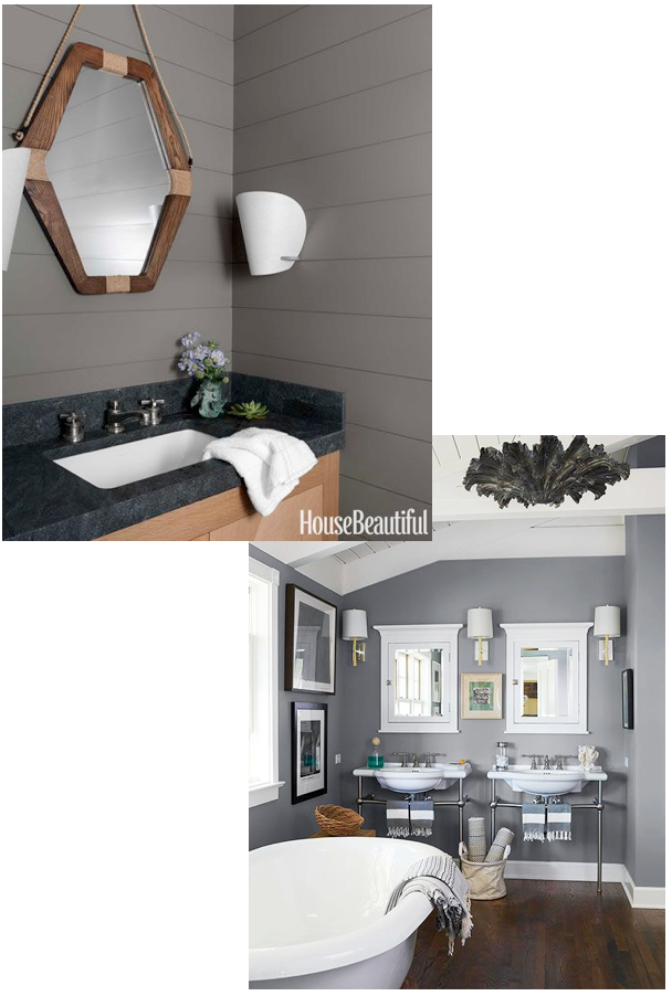
Since we had to look at finished or replacing the large builder mirror, the frame for this was a natural placement for the wood element. I suggested a few options. The first was to frame out the existing mirror. The second was to layer a wood framed mirror over top of the existing mirror.


Bringing in some darker metal elements would reference the feel of her main living space. I suggested a  small wall cabinet or shelf over her toilet, in/on which she could place white towels and accessories to again bring that freshness back into the space. A did not like here existing towels hook beside the sink, which was rather largely proportioned. I suggested a modern hook option here, something unexpected to add interest.


After looking at all my recommendations, A decided the paint was perfect, and she would frame out the mirror in wood, She had found some towel hooks on Etsy that she loved, and wanted work in gold to the mix.


Also, she decided she did not want additional storage, and asked if an art wall would work over the toilet in lieu of the shelf. The area is 36" x 36".


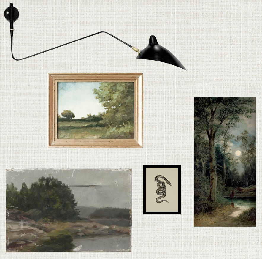
Why not? I'm huge fan of art in every space, a room without art is not complete! This offered an opportunity to repeat the varied metal elements, as well.  A mentioned liking the prints available on Lulu and Georgia, and so that became the starting point for two gallery options. I chose two prints, the Booby Pin piece and the Oh Dear I love you, which A had especially liked, to begin.


 The first grouping was modern and playful, and worked in some colour. Two modern photographs (here and here) flank the Oh Deer print, both referencing the mountains outside. A had mentioned wanting to include a letter, if possible, and so custom wooden letter from Etsy painted gold would add that bit of sparkle. Lastly, a fresh fractal work plays against the photos and grey walls, and keeps the grouping light and airy.


The Bobby Pin started off the second grouping, which is softer and more sophisticated. A watercolor becomes the central piece, the watery texture perfect for a bath. A small pen and ink adds some punctuation and balances the bobby pin print. A steel letter tucks in without stealing the show, and an original oil is absolutely stunning, working in all of our varied tones and adding some subtle colour here.


A chose the second grouping, but her husband did not like the Bobby Pin print, so we needed to work in a replacement. I suggested a nude, which works with the more sophisticated feel of this group. After considering a few options, A chose this print, which is perfect.


After receiving the art, A ordered some frames on Etsy. She chose this wood frame for the abstract watercolor, and this gold frame for the painting.

Now we just needed to finish up with another small piece of art for the entry wall, on the right side of the window. I suggested this original painting. The artist mounts each of her works in vintage frames which are included in the sale. It is a beautiful effect. A agreed. Yay! Love it when a client and myself are completely on the same page!


And that wraps up the bathroom swish, lovelies! I hope you enjoyed, and maybe discovered a few new artists along the way…my apologies if I lured you into lost hours on Etsy - can never get away from once I begin exploring the art shops, lol.

Wishing you all a lovely, Christmas-Carol-filled day - x am


Friday, October 10, 2014

Thanksgiving: Let the Madness Begin...


It's Canadian Thanksgiving this weekend. Yes, so early! Our leaves have turned and are falling rapidly, Autumn has found us already.

Living near cottage country as we do, we usually host both sides of the family here, with back-to-back dinners for 20-30 people. It'a bit manic, to say the least, but we live in the snow belt and our families don't always care to travel up here for Christmas, so Thanksgiving it is! In any case, we love to host a family dinner at holidays, those precious memories are what makes a house a home.

Being slightly decor-obsessed, you would think that the table would be a huge consideration, but really, it's all about visiting with family and the food! We usually have a few candles tucked in amongst leaves, maybe some pumpkins, this year a couple of owl statues made it on, courtesy of the girls. This week I managed to fall while skating with the kids and have been out of commission the past few days, so it look like we will be using paper napkins - no judging, lol! This is set up for the first dinner, so no salad plates, you'll read about that below! The kids have a tradition of gathering leaves for the table during our pre-dinner walk in the woods, but I threw on a fakie so you can get the feel...


My husbands family are former Butchers, and as such meat is the main element of our menu. The first year we hosted, despite my husband saying it wasn't necessary, I made several veggie dishes and salads - which were literally untouched. Lesson learned! We make roast beef, roast turkey and ham. Really. All three, and they are huge.


Let's just say the bbq and quite often a neighbours oven come into use :) When his Grandmother was with us we also made salmon, especially for her, but we've slowly let that go. There's always brussel sprouts (with bacon, of course!), a carrot/turnip mash that is a family favourite, and Mom's stuffing (containing bacon, among other things!). For dessert ah-mazing pumpkin pie from a family favourite bakery.


What about menu No. 2, you ask? My family are former Grocers, with an emphasis on organic goods and vegetarian fare. We make a roast turkey, and quite often have some ham from the previous days menu, but they are only eaten by some of us. Appetizers include prosciutto wrapped melon, pears, cheese and stuffed dates, then it's onto vegetable madness.


My sisters roasted glazed sweet potatoes, roasted asparagus, several salads, homemade orange-cranberry sauce and Mom's artichoke dressing. We are fortunate to have a raw food chef in the family, who always brings a different vegan pie to try each year.


Funny how all those foods that make my husbands family celebration feel special to him now make them feel special to me, as well. He hasn't learned to appreciate veggies quite as much as I have learned to appreciate meat :) but he definitely makes an effort!

Are any of you celebrating this weekend? What will your holiday be like? Hope you all have a lovely weekend surrounded by those you love, that's what we are thankful for the most around here - x am


Thursday, October 2, 2014

Outlining walls in contrasting color….


So just saw this wall treatment pop up again in this spectacular space
and would like to hear what everyone is thinking about it….


Outlining the planes of the wall gives a very different feel to this pale slate, doesn't it?
Without that sharp black contrast these walls would feel airy,
but with the the detail it becomes almost jewelbox-like (for today let's pretend that's a word!!)…
as if to frame the space within those lines, and each section is it's own composition.

another angle…


Yes, it's a bedroom, surprised me too!

By contrast, look a the living space:
 same aesthetic, similar palette (albeit paler, greyer walls).
 No outline of architectural planes - perhaps because of the decorative molding here?


Definitely a different feel, right?
The walls fall into the background, and the grouping must be stronger to appear cohesive.
What do you think? Something you would try?
Would it aid in unifying a disparate grouping of "objets" and art?

And just a side note here - not sure I could live with this many layers, but it is a very personalized, interesting space. I mean, a peacock? That's ballsy.

x am

Thursday, September 18, 2014

Tin Ceiling Tiles + Plexi = Backsplash Art


Tin ceiling panels / tiles are one of my favourite elements in century homes. I die when they are used for a backsplash material. In our very first house, 15 years ago,  I used a wallpaper that looked like tin tile as a backsplash above the existing single row of tile ( I even "rub n' buffed" it so that it had a vintage patina, remember that stuff?!) until I could install the real thing... You know what? It wasn't terrible!

The problem with using this vintage gorgeousness, or anything with a texture for that matter, as a backsplash is that they are not so fun to clean. I'm not sure about you, but I am a bit of a countertop/backsplash germaphobe, both get wiped down thoroughly after cooking.

This is why this photo caught my eye on Pinterest this morning - painted tin tile presented in a grid pattern to the ceiling for a very cool modern take, and the best best part - it's had a layer of plexi or glass layered in front, so that it is completely protected!! Genius. this would take seconds to clean, and having that layer almost gives it art feel, no? It's like we've framed out these beautiful tiles and placed them there for display. I'm in love. In love.


Hope you are having a wonderful day, friends! x am

Tuesday, September 16, 2014

Best Friends : Autumn & Tartan (and plaid, and buffalo check!)


It's been chilly here. Had to turn on the furnace chilly. That means jeans and sweaters and jackets have been pulled out, and we've begun to add layers around the house - specifically blankets!

All this cozy makes a girl begin to appreciate autumn, and with autumn comes tartan, right? Whose with me?


Btw have you ever wondered what the difference between tartan and plaid is? 
Maybe it's just me, lol.. but I looked it up…
according to Wikipedia (the absolute authority, right?) 

"Tartan is often called plaid in North America, but in Scotland, a plaid is a tartan cloth slung over the shoulder as a kilt accessory, or a plain ordinary blanket such as one would have on a bed"

and there you have it, your most burning questions answered here :)


So this is not by any means a fashion blog,
but I've def got my eye one a few things for the wardrobe as well as the house…

A skinny plaid shirt to tuck in under a sweater, 
and in my dream shopping cart, a plaid suit, worn so well.


The bottom photo is what started it all. Damn you, pinterest!
I passed on a sweater like the top right one and am still regretting it.


Early fall outfits


Late fall outfits
(or maybe early fall, if you live near me!)


1 2 3 4 5 6 


Since I'm blogging from canada, I'm going to say that buffalo check counts as plaid, 
because they are inseparable here - Canadians being lumberjacks and all ;) 
That Kate spade bag is the cutest. THE cutest.  
Of course a shirt from Aritzia is on the list. Enter store = budget blown!


The scarves are from  H&M,  Roots,  Scotch and Soda  and  Ebay.
Yes ebay - that last one is a not a great photo but is much more vibrant up close,
 and is also available in a pattern close to Black Watch.
 Cost : $11.00. Really. 


The slipon's are from Target, and I bought them in the leopard as well, not going to lie! 
Those yummy Hunter boots are available at Marshall's right now… really trying to stay away, sort of…


Any plaid items tickling your fancy? Maybe you are lucky enough to still be living with sunshine…

I'll move onto plaid items for the home later in the week - must get to work! Three consults on the go - x am


Monday, September 15, 2014

10 Minute Large Canvas Art DIY


Happy Monday! Hope you had a fabulous weekend :)  Hockey madness has begun here - with two kids playing and a third swimming competitively, we are officially outgunned, lol.

What about that title? Sounds impossible, right? Well, what if you thought of your art as a place to simply add a bold splash of colour, and painted out a huge canvas in a solid shade? That's exactly what this is - a canvas painted out black, as found on Rue. It becomes part of the composition, grounds the whole wall, and functions as decor. Almost like colour-blocking a wall, but so much less permanent, and really, you could change this with the seasons if you wanted - a deep merlot for winter, a beautiful azure for summer, etc...


Thats about as much time as I have to make art these days! You? Thoughts?

x am


Wednesday, September 10, 2014

Palette: Bone and Black | Inlaid Bone


So I've been posting about bone and black this week, and of course must include inlaid bone furnishings. I cannot fathom the hours of work that go into these gems, it truly is an art form. In a quiet interior the pattern would add so much visual interest, yet is graphic enough that other colours and patterns can be played against. Wouldn't you love to have one of these pieces somewhere in your home?


The Traditionals


The Contemporaries


Subtlety in White on White 

Against a black wall? Heaven.


The Easy Update


The To-Die-For

From the home Of Jessica Marx
Can somebody please place one of these on either side of my bed? Thank you.


1 2 3 4 5 6 7 


You can also use furniture inlaid with Mother of Pearl for a similar effect, just with a little more sheen. I prefer bone, it is more matte and allows the pattern to take centre stage. Is this something you would use in your home or for a client? Have used?

x am


Tuesday, September 9, 2014

Palette: Bone and Black | Kitchen


Today I thought we might look at a few kitchens that have eschewed the traditional white for bone and shades of black… my dream kitchen would include some of these elements, like the stone floor below - perfection.


Rustic woods and stone floors. 
No glam here - this is all about scale and simplicity, allowing the textures to speak for themselves. 
Wish we could see this in the evening, with all those lights on...


Okay, it's not really a kitchen, but it's so darling! Those sconces completely make the vignette, right?


A black-stained plank floor laid in a herringbone fashion ground the space. 
I love, love, love the understated hardware and slab backsplash - so quiet.
Rare for a kitchen to have this ethereal quality.


Small in stature but large in interest, the floor balances the black range and energizes the space.


Will be back with another bit of black and bone in the next days... fantastic to be finally posting these!

x am

Monday, September 8, 2014

Palette: Bone and Black | Art


Let's take the time-worn lustre of bone, and juxtapose it against the sharpness of black.... Opposites attract, yes?


I'm going to do a few posts on this combination this week.  The genius pieces of artist Jennifer Arment have caught my eye. Usually artists will pair black with a crisp pure white, but she chooses the softer palette. it adds a level of sophistication to her work. While the composition and simplicity of form are beautiful, it's the wit, the tongue-in-cheekness that I love.


These are strong enough to stand alone, but wouldn't they be a welcome addition to a gallery wall paired with vintage oils, or some high contrast nature photography? Rooms that take themselves too seriously are boring, after all!


What do you think? Feeling this palette? The art?